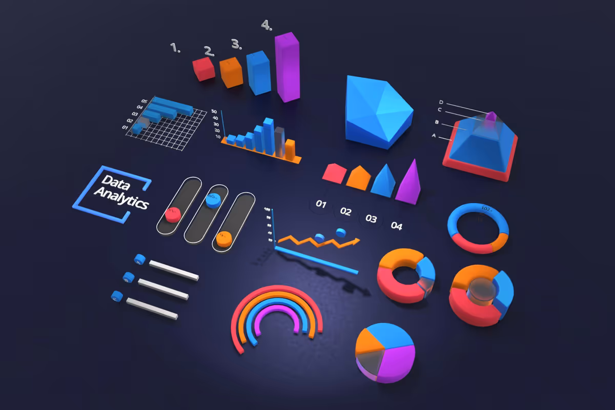
Pulse began as a challenge: create a dashboard powerful enough for analysts yet clear enough for everyday users. The solution was a layered interface that adapts to information density — using motion, color, and layout shifts to surface what matters most.
I started by mapping out the emotional journey of someone interacting with analytics. People want clarity, not complexity. With that in mind, I designed a modular panel system where each chart dynamically adjusts its scale, contrast, and highlight logic based on incoming data patterns.
The visual language centers around crisp geometry and subtle gradients, reinforcing a sense of reliability. To avoid overwhelming users, I implemented progressive disclosure: details fade in only when the user hovers or expands a panel, allowing the screen to breathe even during heavy data sessions.
Performance was a key concern. Real-time updates can easily overwhelm UI frameworks, so I collaborated with engineers to create a lightweight rendering method that refreshes only the parts of a chart that change. The result is an experience that feels smooth even during peak activity.
Pulse has since become a central tool for teams who need clarity at a glance and depth on demand. It’s a system built not just to show data — but to make it meaningful.